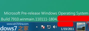
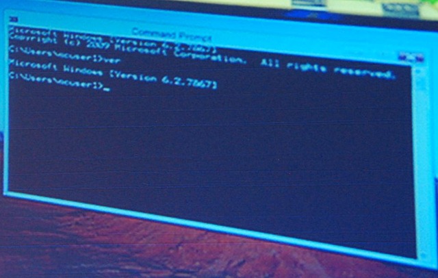
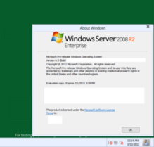
Some early screenshots of Windows 8 have leaked recently, providing some clues as to what changes we might see in the user interface.
- User Account Pictures in the Taskbar
Two screenshots show a 32×32 px (actually 28×32 px in the second screenshot) user account picture in the taskbar, located between the clock and ‘show desktop’ button:
- Updated Language Bar
Assuming the ‘ENG’ in the second screenshot above refers to ‘English’, an updated language bar may be part of Windows 8. (The three letter language code would mark a change from ISO 639-1 found in previous versions of Windows to ISO 639-2.)
- Centred Window Titles
Rafael Rivera spotted this in Sinofsky’s Windows 8 ARM demo at CES earlier this year. (Photo by Long Zheng.)
A new screenshot seems to confirm this:
Windows has had left-aligned window title text since Windows 95 – in Windows 3.1 and earlier it was centred. Office 2007 and 2010 notably broke that convention, however, using centred text as part of their custom-drawn title bars (make a Microsoft Word window narrow enough and you can see the custom chrome replaced with the OS standard).
Refreshed DWM-lessNew ThemeWhile the resolution of the screenshot immediately above leaves a lot to be desired, we can still see some clear differences from Aero Basic as it appears in Windows Vista and Windows 7 (update: in fact, this theme might be a DWM-enabled theme). The window border colour is almost flat (there is a very subtle gradient), the window corners appear to be square at the top as opposed to just the bottom, and the ‘X’ on the close button is coloured black, not white (the window appears not to be active). Additionally, it looks like the close button is flush with the window border (as in Aero), in contrast to Aero Basic where a 7 pixel border is drawn above the caption buttons. Finally, the button control seems to have a new theme.


