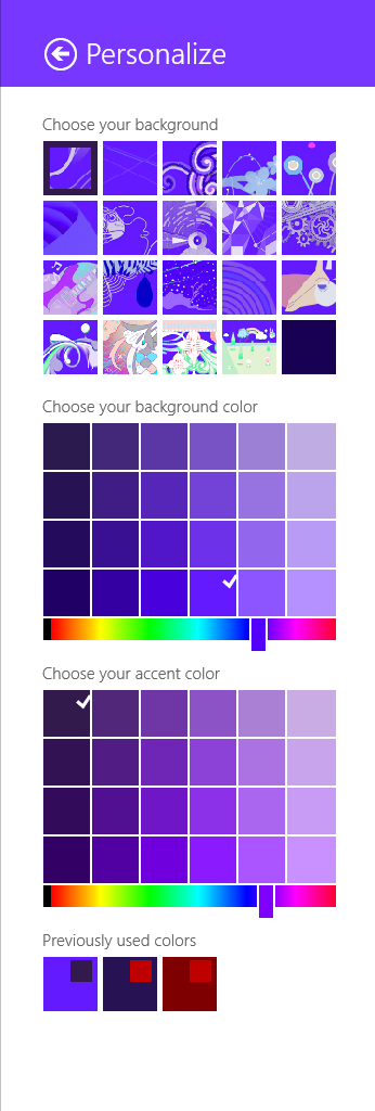
As I noted in my earlier post, the method for selecting theme (‘accent’) colours in Windows ‘Blue’ build 9364 has changed from Windows 8 RTM. I’m not going to bother looking too closely at the updates to the functions in UxTheme.dll this early in the development process, but I did notice two new registry values in the key HKCUSoftwareMicrosoftWindowsCurrentVersionExplorerAccent: ‘AccentColor’ and ‘StartColor’. These are DWORD values that store the accent colour and background colour, respectively. The format is 0xAABBGGRR. The old ‘ColorSet_Version3’ value from Windows 8 is gone for obvious reasons. ‘AccentId_v8.00’ from Windows 8 is now ‘MotionAccentId_v1.00’, but it seems to serve the same purpose – indicating which background image is selected.
Category: Programming
Native Tooltips in WPF (Part 2)
In part 1 of this article I looked at the differences between WPF tooltips and ‘native’ (Win32) tooltips. In this part I present a sample WPF application that displays native tooltips. I’d planned to walk through some of the code here, but that turned out to be a bit tedious, so you’ll have to make do with the comments in the sample.
NativeToolTip.7z
11,271 bytes; SHA-1: 4ABD39CE46F5386E6D2DFF4A788AC3231DFA8765
Limitations:
- ToolTipService.Placement must be set to ‘Mouse’ (the default). Custom positioning is not available. (You could implement it with a tracking tooltip, but that’s easier said than done.)
- Native tooltip content is limited to simple strings.
Remarks:
- TTM_POPUP doesn’t work if the ‘rect’ field of the TOOLINFO isn’t set. This had me stumped for a while.
Windows ‘Blue’ Build 9364 Observations
Update (2013-04-21): the thin borders are all gone in build 9374.
It looks like Microsoft isn’t changing tack with the next release of Windows – the recently leaked build 9364 of Windows ‘Blue’ contains a bunch of worthwhile changes to the Modern/Metro/Immersive environment, but the desktop seems to be basically untouched from Windows 8. If you hated Windows 8, you’ll probably hate Windows ‘Blue’. If you’re ambivalent, like me, about Windows 8, you’ll probably feel the same way about Windows ‘Blue’. I don’t think I’ve met anyone who loves Windows 8 outright, but that person will love Windows ‘Blue’.

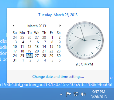
The only UI changes on the desktop that I’ve spotted so far are related to window borders – the borders of the clock and action centre pop-up windows are now 1 pixel wide (and the windows are set 16 pixels from the edge of the screen/taskbar). The volume control retains the Windows 7/8 look (fat borders, 8 pixel margin). Continuing on the theme of window borders, certain windows have thin (~3 pixel) borders, as shown below. I’m not sure what window styles cause this effect, but the same thing happened in pre-release Windows 8.

On the Modern-Desktop integration front, bringing up the ‘Share Charm’ now has options for sharing a screenshot of the desktop (though I can’t get this to work) and for opening SkyDrive. That’s about it.
The method of selecting theme accent and background colours has changed significantly, and it seems like that post I wrote about the GetImmersiveColor* functions will be obsolete soon. It’s now possible to select basically any colour combination (see below), which makes it quite easy to get unreadable text. Too much choice can be a bad thing, and I prefer the Windows 8 approach of a limited set of colour combinations that have been tested thoroughly to make sure all text is readable.

It will be interesting to see how quickly this version is pushed out the door. I’m quite surprised to see the version number bumped up to 6.3 (Windows 8 is 6.2), which could indicate that this will be a bigger release than many had assumed. It would be nice if the desktop got a bit more attention, but I’m not holding out hope. In this early build of Windows ‘Blue’, none of my pet issues are solved (ClearType missing from text drawn on opaque surfaces for no reason, unnecessary Modern UI encroaching on the desktop for network settings and ‘open with’ dialogs, etc., no Windows Update notifications on the desktop, Modern UI scrollbars in desktop IE, and so on and so forth).
Native Tooltips in WPF (Part 1)
<preamble>
One of my hobbies is getting WPF controls to look more like their native counterparts. I’ve been shoehorning the UxTheme APIs (and older equivalents when theming is unavailable) into something that can be used by WPF over the past year or more, and I’ll write about this process at some point in the future (I’ve implemented native-looking push buttons, radio buttons, checkboxes, scrollbars, list views/list view items, text boxes, group boxes and read-only combo boxes). These efforts pay off the most in Windows 8, since WPF’s theme for that OS leaves much to be desired (just look at the push buttons!). This isn’t entirely surprising given that the theme wasn’t finalised until post-RC, leaving the WPF team without much time to do a good job.
</preamble>
In this post I’ll compare WPF tooltips with Win32 tooltips, and in part 2 I’ll demonstrate how to use Win32 tooltips in a WPF application and post some sample code.
Tooltips in WPF look more or less like traditional Windows tooltip controls. Here are some advantages and disadvantages of each:
WPF Tooltips
Advantages:
- Can host any content, not just text.
- Style them like any WPF control.
- Drop shadow fades in and out.
Disadvantages:
- Colours aren’t quite the same as native tooltips.
- Weird bottom margin/padding with Aero theme.
- Drop shadows don’t look exactly like Win32 tooltip shadows.
- Drop shadows are missing in the Windows 8 theme, regardless of system settings (can be fixed by modifying the control template, which is missing SystemDropShadowChrome, meaning the ‘HasDropShadow’ property does nothing).
- No ClearType without RenderOptions.ClearTypeHint.
Win32 Tooltips
Advantages:
- Consistent with tooltips in native applications.
Disadvantages:
- Can only display text (displaying other things is non-trivial).
- Can’t be styled.
- Drop shadows don’t fade in or out.
- Animations sometimes don’t fire (particularly the fade-in animation).
- Updating the text of an open tooltip can cause redraw flicker.
- Custom positioning can involve a lot of work.
There are some other very minor differences:
- The algorithm for finding the position under the mouse is different in WPF, even though it’s based on the ‘_GetHcursorPdy3’ function from tooltips.cpp, according to the reference source.
- When the content of a native tooltip changes, the tooltip will be repositioned beneath the cursor. WPF tooltips remain fixed in place.
WPF ToolTip Drop Shadows in Windows 8
The standard ToolTip control template for the Windows 8 theme in WPF (‘Aero2’) has no drop shadow, whether or not the HasDropShadow property is set. The background colour and margins are also slightly off compared to the native style.
The following template produces a result that’s closer to the real thing:
|
1 2 3 4 5 6 7 8 9 10 11 12 13 14 15 16 17 18 19 20 21 22 23 |
<Style TargetType="{x:Type ToolTip}"> <Setter Property="Foreground" Value="#FF575757" /> <Setter Property="Background" Value="#FFFFFFFF" /> <Setter Property="Padding" Value="5,1,6,2" /> <Setter Property="HasDropShadow" Value="{DynamicResource {x:Static SystemParameters.DropShadowKey}}" /> <Setter Property="Template"> <Setter.Value> <ControlTemplate TargetType="{x:Type ToolTip}" xmlns:themes="clr-namespace:Microsoft.Windows.Themes;assembly=PresentationFramework.Aero"> <themes:SystemDropShadowChrome Name="Shdw" themes:SystemDropShadowChrome.Color="Transparent" themes:SystemDropShadowChrome.CornerRadius="0" SnapsToDevicePixels="True"> <Border Name="Border" Background="{TemplateBinding Background}" BorderBrush="{TemplateBinding BorderBrush}" BorderThickness="{TemplateBinding BorderThickness}" SnapsToDevicePixels="True"> <ContentPresenter TextOptions.TextFormattingMode="Display" Margin="{TemplateBinding Padding}" HorizontalAlignment="{TemplateBinding HorizontalContentAlignment}" VerticalAlignment="{TemplateBinding VerticalContentAlignment}" /> </Border> </themes:SystemDropShadowChrome> <ControlTemplate.Triggers> <Trigger Property="HasDropShadow" Value="True"> <Setter TargetName="Shdw" Property="Margin" Value="0,0,5,5" /> <Setter TargetName="Shdw" Property="themes:SystemDropShadowChrome.Color" Value="#71000000" /> </Trigger> </ControlTemplate.Triggers> </ControlTemplate> </Setter.Value> </Setter> </Style> |
You’ll need to add a reference to PresentationFramework.Aero in your project (note the ‘themes’ namespace used in the control template).

The top image shows a standard Windows 8 tooltip, the middle shows the default tooltip appearance for WPF applications running in Windows 8, and the bottom shows a WPF tooltip using the above template. Note that the Win32 and WPF drop shadows are slightly different in appearance. Additionally, the WPF shadow fades in and out with the tooltip, while the Win32 shadow just pops in and out.
Now, you’ll only want to use this template when the user is running Windows 8, and if the user changes themes you’ll no longer have tooltips that match the native style.
SetDPI Utility Version 2
A couple of years ago I made a small command-line program for setting the DPI/PPI of PNG files. I used the System.Drawing.Bitmap class (i.e. GDI+) to set this property, which had the unfortunate side effect of producing relatively bloated files. Given that the chunk specifying this property is only 21 bytes long, I thought I could do better.
SetDPI version 2 searches for the pHYs chunk and updates it directly, or adds it immediately before the first IDAT chunk if it doesn’t already exist. Files produced by this tool will be at most 21 bytes larger than the original (or the same size when the pHYs chunk was already present).
SetDPI.7z
13,478 bytes; SHA-1: 800D83A390F2AD80772D79D7FB45C7EAAB0D4294
Image Background Remover Tool
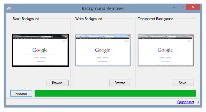
Inspired by Window Clippings, my preferred screenshot tool (which unfortunately crashes a lot under Windows 8 RTM), I wrote a small program for making image backgrounds transparent.
It comes with a command-line interface and a basic GUI (pictured above). The GUI supports dragging-and-dropping images, and you can switch the black and white images by right-clicking on either. The source code is included, along with a sample set of images.
The command-line syntax is: BackgroundRemover.exe imageout imageblack imagewhite
Thanks are owed to Ian Griffiths for the equations used to calculate transparency.
BackgroundRemover.7z
478,473 bytes; SHA-1: 002CF9C89B918951BBC7DECB9F9C1A8D53008E1F
Windows Update Notification Tool for Windows 8
I was apparently part of the 5.82% of Windows 7 users who preferred to be notified about updates rather than have them installed automatically. Annoyingly, Windows 8 no longer displays the familiar balloon tip and notify icon when new updates are available, instead placing a notice on the lock screen (which I almost never have occasion to see on my desktop). I found this frustrating enough that I decided to write a small unmanaged program to mimic the basic functionality of the old notify icon. It also supports automatic installation of specified updates (identified by their Knowledge Base ID – I use this to install Windows Defender definition updates). You can find out more and download the tool here:
Pixel-perfect Multi-DPI Images in WPF (Part 3)
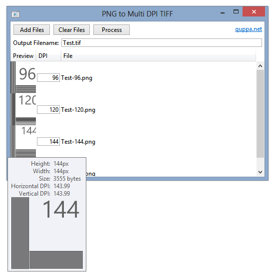
In Part 1 of this series, I discussed the problem of displaying different bitmap images at different DPIs in WPF. In Part 2, I proposed a solution using multi-frame TIFFs and two simple markup extensions. In this final post I will present a basic program that takes multiple images (PNG recommended), gives the option to specify the DPI of each and generates a multi-frame TIFF file accordingly.
I think the UI is self-explanatory. The program attempts to provide an output filename based on the pattern of the names of the input files. Alternatively, you can specify an absolute or relative file URI of your own.
Add files to the list by dragging and dropping them onto the window or click ‘Add Files’. Hovering over an image will display the unscaled image (to a point) in a tooltip, as shown above.
As mentioned in the previous post, avoid using PNGOUT or the like to compress your images – the Windows TIFF decoder has some issues displaying TIFF files made from highly-compressed PNGs.
Apologies to Microsoft for nicking an icon from imageres.dll.
The download includes the program binary (signed) and source (which isn’t particularly well structured or documented).
PNGToMultiDPITIFF.7z
156,593 bytes; SHA-1: 4CD2D2A7F7CE124A95D7900CBE89CAA1E0310790
Pixel-perfect Multi-DPI Images in WPF (Part 2)
In Part 1 of this series, I explored the issue of displaying pixel-perfect bitmap images in the Windows Presentation Foundation. In this article, I’ll describe a method of displaying different images depending on the system DPI setting using a custom Markup Extension and multi-image TIFF files.
Tagged Image File Format (TIFF) files may contain multiple images, and WPF contains support for this format out of the box. You can use the TiffBitmapEncoder class to combine multiple images into one TIFF – I made a tool called PNGToMultiDPITIFF that does just this, but I’ll leave that to Part 3.
To pick the best-matching image from a multi-frame TIFF, I created two Markup Extensions – one for creating an ImageSource, and one for setting the image’s BitmapScalingMode. If the TIFF contains an exact match for the current DPI, the BitmapScalingMode can be set to NearestNeighbour (as there should be no scaling). If not, it will be set to ‘Unspecified’ (which means ‘Linear’ in WPF 4 or newer) so it looks better.
MultiDPIImage.7z
1,229 bytes; SHA-1: BB0B8867C48ECEADD7655E792DAA780A30299747
You can download the code for the Markup Extensions above.
|
1 |
<Image Source="{local:MultiDPIImageSource 'MultiDPIImage.tif'}" RenderOptions.BitmapScalingMode="{local:MultiDPIImageScalingMode 'MultiDPIImage.tif'}" /> |
As discussed in the previous post, remember to set UseLayoutRounding and SnapToDevicePixels to true on your Windows.
Code Discussion
The code for the markup extension is quite simple. To get the image frames, we use the TiffBitmapDecoder class:
|
1 |
TiffBitmapDecoder decoder = new TiffBitmapDecoder(this.imageuri, BitmapCreateOptions.None, BitmapCacheOption.Default); |
We loop through the frames to see if any match the system DPI. If there is no exact match, the first frame with a DPI above the system DPI is selected. If there is no such frame, we just pick the frame with the highest DPI.
|
1 2 3 4 5 6 7 8 9 10 11 12 |
SortedList<int, BitmapFrame> sortedframes = new SortedList<int, BitmapFrame>(); foreach (BitmapFrame frame in frames) if (!sortedframes.ContainsKey(GetDPI(frame.DpiX, frame.DpiY))) sortedframes.Add(GetDPI(frame.DpiX, frame.DpiY), frame); foreach (var frame in sortedframes) { if (frame.Key == DPI) return frame.Value; if (DPI < frame.Key) return frame.Value; } return sortedframes.Last().Value; |
The code for choosing the BitmapScalingMode is similar – instead of returning an image, we return ‘NearestNeighbour’ if there is an exact DPI match or ‘Unspecified’ otherwise. If you want to use a different BitmapScalingMode fallback, you can specify an optional second paramater in MultiDPIImageScalingMode:
|
1 |
<Image Source="{local:MultiDPIImageSource 'MultiDPIImage.tif'}" RenderOptions.BitmapScalingMode="{local:MultiDPIImageScalingMode 'MultiDPIImage.tif', Fant}" /> |
Drawbacks
- Images set with the markup extension will not be visible in the WPF designer (Visual Studio or Blend). I’d welcome any suggestions on how to fix this.
- Avoid using PNGOUT or PNGGauntlet on PNG images before putting them into multi-frame TIFF files. The Windows TIFF decoder has some issues with compressed PNGs.

