WM_DWMCOLORIZATIONCOLORCHANGED doesn’t give the Aero Glass base colour

From MSDN:

WM_DWMCOLORIZATIONCOLORCHANGED Message

Sent to all top-level windows when the colorization color has changed.

Parameters
wParam: Specifies the new colorization color. The color format is 0xAARRGGBB.
lParam: Specifies whether the new color is blended with opacity.

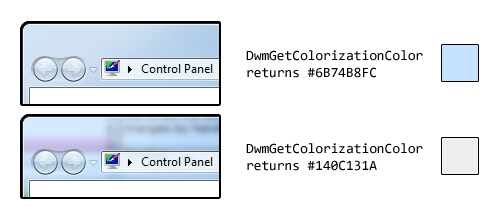
We receive this message when the Aero Glass colour changes. Unfortunately, the value contained in wParam is not the ‘base colour’, as it is in fact the result of the DwmGetColorizationColor function. As Rafael Rivera noted last year, when glass transparency is enabled, the value returned by this function is quite different to the base colour:

colorization

As such, we shouldn’t rely on the contents of wParam (or on the DwmGetColorizationColor function in general).

The easiest method to find the actual base colour is to retrieve the ColorizationColor DWORD from HKCUSoftwareMicrosoftWindowsDWM. This, however, is undocumented, and could potentially change in a future version of Windows (it is correct in NT 6.0 and 6.1):

(We can’t cast directly to uint despite it being a REG_DWORD, hence the first cast to int…)

For those who feel more adventurous, Rafael went to the trouble of finding a function in dwmapi.dll which returns the base colour (amongst other things). He describes it here.

Office 15: per application border colours?

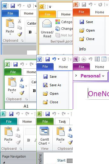
Winreview.ru’s latest Office 15 screenshots reveal application-specific border colours and drop-shadows. Word gets a dark blue border and shadow, Excel gets a green border and shadow, etc.:

Office 15.0.2703.1000 Borders

Microsoft in fact applied for a patent for per-window glass colourisation in late 2005 (‘Glass appearance window frame colorization’; discovered by Long Zheng in 2007). While there isn’t any glass in the Office 15 windows shown here (despite the DWM being enabled), the idea is similar.

Outlook 15

Office 15 and Windows 8 seem to be moving in similar UI directions – it seems like square corners are in and transparency is out (at least for the ‘Aero Lite’ theme).

Early Windows 8 UI Changes

Some early screenshots of Windows 8 have leaked recently, providing some clues as to what changes we might see in the user interface.

  1. User Account Pictures in the Taskbar

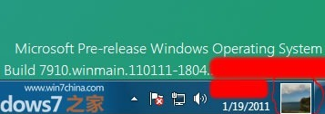
    Two screenshots show a 32×32 px (actually 28×32 px in the second screenshot) user account picture in the taskbar, located between the clock and ‘show desktop’ button:

    Windows 8 Taskbar 1

    Windows 8 Taskbar 2

  2. Updated Language Bar

    Assuming the ‘ENG’ in the second screenshot above refers to ‘English’, an updated language bar may be part of Windows 8. (The three letter language code would mark a change from ISO 639-1 found in previous versions of Windows to ISO 639-2.)

  3. Centred Window Titles

    Rafael Rivera spotted this in Sinofsky’s Windows 8 ARM demo at CES earlier this year. (Photo by Long Zheng.)

    Windows 8 Title

    A new screenshot seems to confirm this:

    Windows 8 Title 2

    Windows has had left-aligned window title text since Windows 95 – in Windows 3.1 and earlier it was centred. Office 2007 and 2010 notably broke that convention, however, using centred text as part of their custom-drawn title bars (make a Microsoft Word window narrow enough and you can see the custom chrome replaced with the OS standard).

  4. Refreshed DWM-less New Theme 

    While the resolution of the screenshot immediately above leaves a lot to be desired, we can still see some clear differences from Aero Basic as it appears in Windows Vista and Windows 7 (update: in fact, this theme might be a DWM-enabled theme). The window border colour is almost flat (there is a very subtle gradient), the window corners appear to be square at the top as opposed to just the bottom, and the ‘X’ on the close button is coloured black, not white (the window appears not to be active). Additionally, it looks like the close button is flush with the window border (as in Aero), in contrast to Aero Basic where a 7 pixel border is drawn above the caption buttons. Finally, the button control seems to have a new theme.

SetDPI Utility

View source on GitHub.

Updated 2013-01-06.

Ken Silverman’s PNG compression tool PNGOUT (complemented nicely by the free .NET frontend PNGGauntlet) can be remarkably effective at trimming the size of PNGs without altering the image described within.

However, in its quest to remove anything non-essential, PNGOUT by default strips out the image’s DPI (in fact PPI) information. PNGs without PPI information will be treated differently by different software.

WPF either uses a default of 96 or the current system DPI with such images (I’m not sure which, but the latter makes more sense). Sometimes this can have nice side-effects, as Scott Hanselman discovered – images that were designed for 96 PPI but set to 72 PPI were suddenly ‘fixed’ (at least when the application was run in a 96 DPI environment). Better than relying on WPF’s interpretation of PNGs without PPI information is to correctly set the PPI in the first place. For example, if an image is designed for 120 DPI but has its PPI set to 96, WPF will (correctly) try and scale the image, which is clearly not desirable.

PNGOUT features a command line option /k# for removing or keeping optional chunks. The pHYs chunk holds the PPI information, which is what we want to leave alone. Using the command line option /kpHYs with PNGOUT will thus preserve PPI information. (Information from WulfTheSaxon.)

Sometimes, though, it is useful to have a utility that sets PPI information for lots of images at once (the PPI information in the PNGs may not be correct before using PNGOUT, for instance, rendering the /kpHYs switch pointless).

Josip Medved had the same thought and created a tool for setting the PPI to 96 for many images at once.

I decided to slightly extend his tool to take the desired horizontal and vertical PPI as command line arguments. The source and binaries can be downloaded here (SHA-1: 800D83A390F2AD80772D79D7FB45C7EAAB0D4294). The usage is SetDPI dpiX dpiY filepattern1 [filepattern2 […]].

Examples:

  • SetDPI 96 96 *.png (sets all PNG files to 96 PPI)
  • SetDPI 120 120 a.png b.png c.png (sets a.png, b.png and c.png to 120 PPI)
  • SetDPI 144 144 C:Images*.png (sets all PNG images in directory C:Images to 144 PPI)

Default Password for ‘myLGNet’ Wireless Networks

If ever you stumble across a wireless network with the name ‘myLGNet’ and have need to access it, the default password is ‘123456789a’.

Of course, if the network uses only WEP for protection, it shouldn’t be hard to gain access even without that knowledge.

Adventures in Password Security: AirAsia

When I created a user account at AirAsia’s website a little while ago, I was surprised to be told to choose a password with a minimum length of 16 characters*. I suspect that the average user’s password doesn’t approach that length (perhaps it would be better if it did). In any case, I duly typed in my combination of letters and numbers and went about my business, happy to believe that such an onerous requirement said something about AirAsia’s commitment to security.

A month down the track, I went back to the website only to find I’d forgotten which password I had chosen – for whatever reason, my browser had not saved my credentials. After a few guesses, I gave up clicked the ‘Forgot Password’ link (making sure nobody was looking; I must not be the only one embarrassed to have to have to rely on that feature). I typed in my email address and received a message shortly afterwards.

Lo and behold, there was my 17-character password in plain text, staring right at me.

Oh, well – if someone happens to steal their database, at least it won’t be any of my usual passwords that they find – those are shorter than 16 characters 🙂

(*I see that the requirement is now for only 8 characters.)

Pixel Measurements in WPF

Part of the beauty of the Windows Presentation Foundation is that it is designed to be resolution independent – that is, a WPF application should scale perfectly no matter the system’s DPI setting (excluding any bitmap graphics, which mightn’t look as nice as the vector parts).

Instead of measuring things in pixels, WPF uses Device Independent Units (DIUs). If you only ever use 96 DPI (100%), you won’t notice the difference: at that setting, 1 pixel is the same as 1 DIU. Increase the system DPI, though, and this will no longer hold true. For example, at 120 DPI (125%), 1 DIU will be represented as 1.25 pixels. At 144 DPI (150%), 1 DIU = 1.5 pixels. At 192 DPI (200%), 1 DIU = 2 pixels.

Notice that at 120 DPI and 144 DPI, the number of pixels in 1 DIU is not an integer. In cases like these – when edges fall in the middle of screen pixels – WPF uses anti-aliasing by default. This can, however, result in lines that seem blurry (after all, that’s what anti-aliasing does). If this behaviour is undesirable, one can use UIElement’s SnapsToDevicePixels property.

WPF’s built-in handling of DPI scaling is great: in most cases, it should be transparent to both the programmer and user.

Sometimes, though, one might want to measure lengths in pixels, not DIUs. For example, Keiki’s custom window border for when the DWM (Aero) is disabled needs to be 1 pixel thick at any DPI (this is how the system’s notification area applications look). So, how can we specify this?

First, we need to get the system’s DPI setting:

dpiX and dpiY will hold values like 1.0 (96 DPI), 1.25 (120 DPI), 1.5 (144 DPI) and 2.0 (192 DPI).

To specify a pixel measurement, we simply divide the DIU measurement by the DPI factor (dpiX and dpiY should always be the same – at least in Windows 7 and earlier):

This will make the margin 3 pixels thick at any DPI. (For example, at 120 DPI, dpiX = 1.25. 3 / 1.25 = 2.4 DIUs. 2.4 DIUs will be converted by WPF to 3 pixels.)

Fedir Nepyivoda has a neat solution to this problem: instead of manually converting DIU measurements, he created a PixelBorder control (inheriting from Border) that overrides MeasureOverride. Have a look here.

Small Icon Size & DPI in Windows

The GetSystemMetrics function in Windows retrieves system metrics and configuration settings. One such metric is the recommended size (width and height) of ‘small icons’:

Small icons typically appear in window captions and in small icon view.

Another place where small icons show up is the notification area.

MSDN contains a guide to Creating DPI-Aware Applications. It notes the challenge posed by raster graphics and different DPIs. Unlike vector graphics, which can scale without a loss in quality, distinct raster images must be created for different resolutions in order to avoid unpleasant scaling artefacts. (In fact, this is perhaps overstating the benefits of vector graphics: the level of detail suitable for a high-resolution image is not necessarily suitable for a low-resolution image, so using the same vector for all sizes doesn’t always make sense.) Windows icons, as of Windows 7, contain only raster graphics.

Small Icon Sizes

The small icon size varies according to the system DPI and OS version:

DPI Setting Windows 7, XP Windows Vista
96 (Default, 100%) 16×16 16×16
120 (125%) 20×20 22×22
144 (150%) 24×24 26×26
192 (200%) 32×32 36×36

The sizes for Windows Vista (apart from the size at 96 DPI) don’t make much sense – they don’t match up with the DPI scaling ratio. It is possible that this was a mistake, hence the change in Windows 7.

So, if you want to make sure your small icon (e.g. notify icon) looks beautiful under the widest possible range of systems, you should ideally include the images with the sizes 16×16, 20×20, 22×22, 24×24, 26×26, 32×32 and 36×36. If that sounds like a lot of work (it shouldn’t be with a high quality tool like Axialis IconWorkshop), Microsoft’s own recommendation is to include 16×16 and 32×32 pixel icons. Keep in mind, though, that scaling either of those sizes to 20×20 or 22×22 pixels can result in a rather awful-looking icon. While it is still rare to see anything but the default setting of 96 DPI, this will not be the case forever.

WinForms Icon Sizes

When using the System.Drawing.Icon class, it is a good idea to use one of the constructors that takes the icon size as a parameter.

Windows Forms conveniently exposes a property called SmallIconSize in the SystemInformation class. This property gives us a System.Drawing.Size corresponding to values listed above, which we can put straight into our icon constructor:

The equivalent properties in WPF are SystemParameters.SmallIconWidth and SystemParameters.SmallIconHeight.

Both WPF and WinForms wrap around the Win32 GetSystemMetrics function taking the arguments SM_CXSMICON (small icon width) and SM_CYSMICON (small icon height).

Windows 7-style Notification Area Applications in WPF: Recap & Sample

View source on GitHub.

Over the past month I’ve looked at how to implement a Windows 7-style notification area application in WPF.

I covered 6 different topics:

As promised, I’ve put together a small sample project to illustrate all this code working together (with some added polish):

NotifyIconSample.7z
42,775 bytes; SHA-1: 513E998F4CCFC8C5BB6CA9F8001DA204C80FDF3A

The code has a good level of documentation, but I recommend you read the above posts to understand the ideas behind it.

Windows 7-style Notification Area Applications in WPF: Part 6 (Notify Icon Position: Pre-Windows 7)

View source on GitHub.

In Part 2 of this series I demonstrated how to use the Shell_NotifyIconGetRect function to find the position of a notify icon. This function is new to Windows 7, however, and we must find a different solution for earlier versions of Windows.

This turns out to be quite difficult. A post on the MSDN forums by user parisisinjail provided a good starting point, and it led me to a Code Project article by Irek Zielinski that explained exactly what to do – in native code. This post shows how to implement this kind of approach in managed code.

I have verified that the following code works with Windows XP and Vista. It also works under Windows 7, but only when the icon is not located in the notification area fly-out (not found in previous versions). As such, this solution should only be used when Shell_NotifyIconGetRect is not available.

The basic idea is that the notification area is actually just a special Toolbar control, with each icon being a toolbar button. We want to find the toolbar control and loop over the buttons until we find the one that corresponds to our notify icon. We can then find the coordinates of the toolbar button. (The fly-out in Windows 7 has a separate toolbar control, so you could search that instead of using Shell_NotifyIconGetRect if you really wanted to.)

The process sounds straight forward, but the implementation is quite tricky. Read on for the code.

Continue reading “Windows 7-style Notification Area Applications in WPF: Part 6 (Notify Icon Position: Pre-Windows 7)”