When should a program’s UI animations be disabled?

Modern frameworks like the Windows Presentation Foundation, its relative Silverlight and the upcoming Windows Runtime make it easy to add animations to a program’s graphical user interface. When implemented well, animations subtly improve the user experience and can demonstrate a high level of polish in your application. The Zune client software and Windows Live Messenger both feature beautiful animations – coincidentally, both were written with internal Microsoft frameworks (Iris and ‘DirectUI’, respectively; the second is apparently unrelated to anything in WinRT). The Twitter client MetroTwit shows what can be done in WPF (its interface was inspired by the Zune software and the Metro design language).

There are times, however, when animations may become detrimental to the user experience. Animations may appear choppy on lower-end or older systems (especially with heavy frameworks like WPF), and in general they should be disabled entirely for Remote Desktop Connection sessions (only very fast networks with low latency may be able to handle them). Jossef Goldberg from the Visual Studio team has written about the efforts made to bring the performance of Visual Studio 2010 over remote connections up to par, and while his advice is mainly about WPF, the same principles apply to other frameworks, also.

So, how can we decide whether animations should be disabled or not? The answer will likely vary from project to project, but there are a few things that we can do:

1. Check if the program is running in a remote session

In Win32, use the GetSystemMetrics function to get the SM_REMOTESESSION metric (a non-zero result means it is a remote session). In WPF, use the SystemParameters.IsRemoteSession property in the System.Windows namespace. In Windows Forms, use the SystemInformation.TerminalServerSession property in the System.Windows.Forms namespace.

2. Check if animations are enabled in Windows

Windows Vista introduced many new animations to common controls like buttons (notice the smooth glow effect and compare it to the binary states found in Windows XP). Regrettably this change made most owner-drawn implementations look shoddy since they mostly lack animation (e.g. buttons in Firefox), but that’s a topic for another post.

Anyway, these animations can be switched off in the following dialog (aside: the list box was mercifully increased in size in Windows 7, though the window still isn’t resizable):Performance Options Screenshot
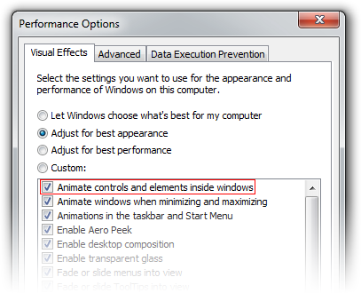
If the user has disabled animations here, it’s probably a good idea to respect that choice in any program you write. We can use the SystemParametersInfo function with the SPI_GETCLIENTAREAANIMATION parameter to check the system setting (or use the SystemParameters.ClientAreaAnimation property in the System.Windows namespace, but note that this always returns true in Windows XP). This only applies to Windows Vista and later.

3. WPF-only: Check the graphics rendering tier

The RenderCapability.Tier property in the System.Windows.Media namespace gives an indication of the graphical capabilities of the system. There are currently 3 tiers, and while the exact meaning may change between .NET releases (as it did in .NET 4.0), this property can be used to help determine what animations, if any, should be enabled.

4. Ask the user!

It can’t hurt to give the user a choice about animations. The remote session checks described above will work for RDP, but there are other technologies available, and we don’t want to punish VNC users by invalidating the entire window 60 times per second for some fancy animation, even if we can’t tell that they’re connecting remotely. If exposing such an option in the UI doesn’t make sense, at least offer it as a command line switch.

Addendum (2011-11-20)

Snooping around PresentationFramework.Aero.dll in .NET Reflector, I happened to come across the ‘Animates’ property in the ButtonChrome class (Microsoft.Windows.Themes namespace):

Similar properties can be found in the other *Chrome classes. Checking the computer’s power status isn’t something covered in this article, but it’s certainly a good idea.

Windows Theme Fonts

View source on GitHub.

Update: See this post for a sample implementation in WPF.

Screenshot of Task Dialog (Aero)

Have you ever wondered how to access the various font colours and styles found throughout Windows, such as that of the ‘Main Instruction’ text in the Task Dialog shown above?

If you are using WPF, the SystemFonts class might sound promising at first. However, this class only exposes the following: the icon font, caption font, small caption font, menu font, message font and status font. These aren’t very exciting – in fact, they are all simply 9pt Segoe UI in Windows Vista/7 Aero. (Aside: early Windows 8 builds use 11pt Segoe UI Semilight as the caption (and small caption) font.) For those using Win32 directly, the SystemFonts class wraps around the SystemParametersInfo function (specifically with the messages SPI_GETNONCLIENTMETRICS and SPI_GETICONTITLELOGFONT) the GetThemeSysFont function.

MSDN offers some guidance on default fonts and colours in Windows Vista/7: apparently ‘Main Instruction’ text is 12pt #003399 Segoe UI. This table, while helpful, is not comprehensive, and in general it’s not a good idea to hard-code this kind of thing, as themes/visual styles are liable to change.

The keys lie in the Visual Styles APIs, introduced in Windows XP. In particular, the GetThemeFont function and GetThemeColor function (with the TMT_TEXTCOLOR property identifier), both found in UxTheme.dll. We simply need to specify the ‘part and state’ of the control in question (these are defined in Vsstyle.h and Vssym32.h). ‘Main Instruction’ text, for example, is referenced by the TEXT_MAININSTRUCTION part in the TEXTSTYLE class.

Screenshot of Task Dialog (Classic)

Regrettably, visual styles APIs only work when visual styles are enabled (who’d have thought it?). That is to say, we can’t rely on them with classic themes (Windows Classic and the High Contrast themes).

I emailed the very knowledgeable Larry Osterman about this, and he was kind enough to respond:

AeroStyle.xml tells which metrics to ask for which theme parts (for the OS that matches the version of the SDK it’s in), but there’s no theme API support for classic modes.

Basically they get the metric they’re looking for from the AeroStyle.xml file.

AeroStyle.xml is included in the latest versions of the Windows SDK. It contains the same classes and parts and states mentioned earlier in an XML format. The ‘MainInstruction’ part in the ‘TextStyle’ class looks like this, for instance:

Of interest are the ‘ClassicValue’ elements. When visual styles are disabled, it seems that ‘Main Instruction’ text uses the caption font (8pt bold Microsoft Sans Serif, as it happens).

In closing: you can use GetThemeFont and GetThemeColor if visual styles are enabled, but you will need look at AeroStyle.xml and hard-code the classic theme fall-back values.

WM_DWMCOLORIZATIONCOLORCHANGED doesn’t give the Aero Glass base colour

From MSDN:

WM_DWMCOLORIZATIONCOLORCHANGED Message

Sent to all top-level windows when the colorization color has changed.

Parameters
wParam: Specifies the new colorization color. The color format is 0xAARRGGBB.
lParam: Specifies whether the new color is blended with opacity.

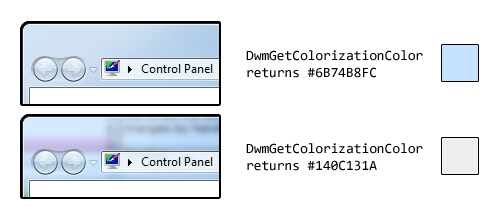
We receive this message when the Aero Glass colour changes. Unfortunately, the value contained in wParam is not the ‘base colour’, as it is in fact the result of the DwmGetColorizationColor function. As Rafael Rivera noted last year, when glass transparency is enabled, the value returned by this function is quite different to the base colour:

colorization

As such, we shouldn’t rely on the contents of wParam (or on the DwmGetColorizationColor function in general).

The easiest method to find the actual base colour is to retrieve the ColorizationColor DWORD from HKCUSoftwareMicrosoftWindowsDWM. This, however, is undocumented, and could potentially change in a future version of Windows (it is correct in NT 6.0 and 6.1):

(We can’t cast directly to uint despite it being a REG_DWORD, hence the first cast to int…)

For those who feel more adventurous, Rafael went to the trouble of finding a function in dwmapi.dll which returns the base colour (amongst other things). He describes it here.

Early Windows 8 UI Changes

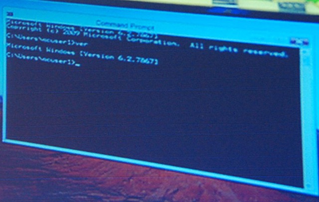
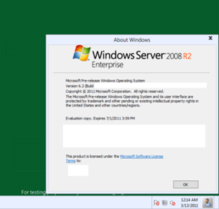
Some early screenshots of Windows 8 have leaked recently, providing some clues as to what changes we might see in the user interface.

  1. User Account Pictures in the Taskbar

    Two screenshots show a 32×32 px (actually 28×32 px in the second screenshot) user account picture in the taskbar, located between the clock and ‘show desktop’ button:

    Windows 8 Taskbar 1

    Windows 8 Taskbar 2

  2. Updated Language Bar

    Assuming the ‘ENG’ in the second screenshot above refers to ‘English’, an updated language bar may be part of Windows 8. (The three letter language code would mark a change from ISO 639-1 found in previous versions of Windows to ISO 639-2.)

  3. Centred Window Titles

    Rafael Rivera spotted this in Sinofsky’s Windows 8 ARM demo at CES earlier this year. (Photo by Long Zheng.)

    Windows 8 Title

    A new screenshot seems to confirm this:

    Windows 8 Title 2

    Windows has had left-aligned window title text since Windows 95 – in Windows 3.1 and earlier it was centred. Office 2007 and 2010 notably broke that convention, however, using centred text as part of their custom-drawn title bars (make a Microsoft Word window narrow enough and you can see the custom chrome replaced with the OS standard).

  4. Refreshed DWM-less New Theme 

    While the resolution of the screenshot immediately above leaves a lot to be desired, we can still see some clear differences from Aero Basic as it appears in Windows Vista and Windows 7 (update: in fact, this theme might be a DWM-enabled theme). The window border colour is almost flat (there is a very subtle gradient), the window corners appear to be square at the top as opposed to just the bottom, and the ‘X’ on the close button is coloured black, not white (the window appears not to be active). Additionally, it looks like the close button is flush with the window border (as in Aero), in contrast to Aero Basic where a 7 pixel border is drawn above the caption buttons. Finally, the button control seems to have a new theme.

Windows 7-style Notification Area Applications in WPF: Part 5 (Fixing Aero Borders)

View source on GitHub.

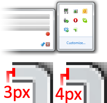
An issue that came to my attention only recently is that the borders of WPF (update: WPF is not actually to blame) windows without captions/title-bars (that is, with ResizeMode set to ‘CanResize’ and WindowStyle set to ‘None’) are drawn incorrectly when the DWM (read: Aero Glass) is enabled. Specifically, the upper and left borders are drawn one pixel too thin (e.g. 3 pixels when the system setting is 4 pixels) and the colour of the bottom and right borders is different to that of other windows. I’ve tried to illustrate these differences in the screenshot below (the image on the left is of a WPF window).

Aero Border Example

It is conceivable that this will be fixed in a future version of WPF Windows, but for now we can use the DwmExtendFrameIntoClientArea function to do it manually. This is only necessary when the DWM is enabled, of course.

Continue reading “Windows 7-style Notification Area Applications in WPF: Part 5 (Fixing Aero Borders)”