Update (2015-04-22): Somewhat surprisingly, a recent Office 2013 patch appears to have fixed this issue.
Update (2015-03-04): Office 2016 fixes this.
Update (2014-10-03): Office 2013 running on the Windows 10 Technical Preview (build 9841) exhibits the same issue 🙁
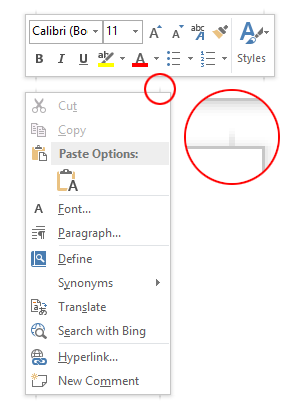
At some point in the not-too-distant past, Office 2013 started rendering strange shadow artefacts in the four corners of all context menus and tooltips:

This didn’t always happen, as a quick search for ‘Word 2013 screenshots’ will reveal lots of images of glitch-free floating windows. I’m too lazy to check, but I’ll hazard a guess that this started happening with Windows 8.1 or Windows 8.1 Update 1.
Being Office, they’ve re-implemented every GUI element themselves instead of letting the OS handle them. One can sympathise with this approach, but it’s important to get the little details right. A bit like how the IE team should finally spend the time to get their scrollbars right. Of course, it’s folly to ever expect UI consistency on Windows when even Microsoft can’t get it right.
A man can dream, though. A man can dream.