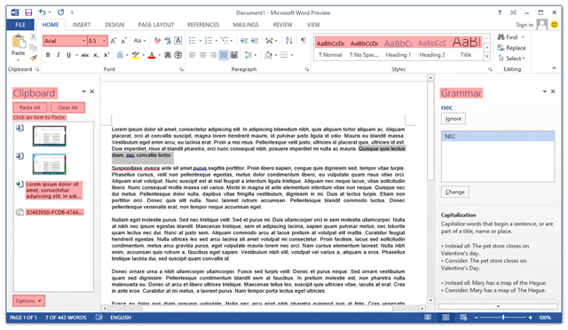
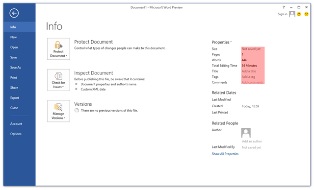
Poking around the Office 2013 Customer Preview, one thing that caught my eye immediately was the lack of ClearType font smoothing. Nearly all user interface elements use ‘greyscale’ font smoothing (as opposed to ClearType’s sub-pixel smoothing). I’ve highlighted the parts of Word 2013 that still use ClearType:
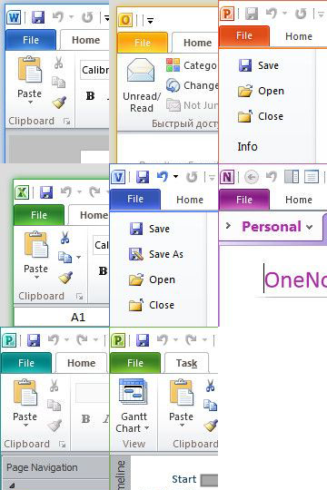
The text in cells in Excel 2013 still respects the system’s ClearType setting, and Outlook 2013 is a real mess (about half-and-half). OneNote 2013 seems to have retained ClearType in most places (outside the ribbon control).
Long Zheng earlier noted the absence of ClearType from the Metro environment and there are several possible reasons for it falling out of favour at Microsoft. Sub-pixel anti-aliasing isn’t necessarily suited to tablets that need to support multiple orientations (unless different sub-pixel orderings are taken into account), and screens with high pixel densities can get away with greyscale font smoothing.
I fear that this is another case of the tablet tail wagging the Microsoft dog – desktop and laptop users of Office 2013 (and Metro-style apps in Windows 8) will have to deal with lower quality text due to the new hardware Microsoft is targeting with its upcoming releases.
The Office 2013 Customer Preview is, of course, just that, and things might change before RTM. Regrettably this wasn’t fixed for the Office 2013 RTM.


