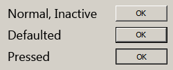
When visual styles are enabled in Windows, one may use the DrawThemeBackground function to draw themed push buttons. However, users of Windows XP, Windows Vista and Windows 7 can disable visual styles by selecting the Windows Classic theme or one of the High Contrast themes (and in Windows 2000 and earlier, visual styles weren’t available at all). The classic theming mode has been removed in Windows 8 (I have written about this previously), so in that OS the visual styles APIs should always be available. I suspect it will be a long time before NT6.1 and earlier versions of Windows constitute an insignificant share of the market, though, so this post should be useful until then.
There are four states that a non-themed button can be in: normal, pressed, defaulted or inactive. How can we draw these states?
The rough non-themed equivalent of the DrawThemeBackground function is the DrawFrameControl function. It has a parameter uType that specifies the type of the frame control to draw – in our case, this should be DFC_BUTTON (= 4). The next parameter is uState. We should set this to DFCS_BUTTONPUSH (=0x0010). For the normal state, this is all that needs to be done. For the inactive state, we should set uType to DFCS_INACTIVE (=0x0100) | DFCS_BUTTONPUSH (in fact, this doesn’t seem to change the appearance of the button frame; the button content/text should be rendered as gray, but that’s out of the scope of this article).
When a non-themed button is pressed or defaulted, it has a single pixel border drawn around it, and the frame control’s bounding rectangle is contracted by 1 pixel on each side. The border’s colour is that of the window frame (COLOR_WINDOWFRAME = 6) – you can use the GetSysColorBrush function to get the appropriate brush. For the defaulted state, just call DrawFrameControl with uType set to DFCS_BUTTONPUSH (with the deflated rectangle). For the pressed state, it might seem like DFCS_PUSHED should be used for uType, but this creates an appearance different to that of standard push buttons. This style is used elsewhere, like on the Windows taskbar, for scrollbar buttons and window caption buttons, etc. Internet Explorer’s owner/custom-drawn buttons also use this style, and I’m sure many other programs do, too. It should be avoided, however, if you’re seeking the native appearance. To properly imitate a pressed push button, avoid using the DrawFrameControl function and use the FrameRect function to draw an inner border with the button shadow colour (COLOR_BTNSHADOW = 16). It’s important to then use the FillRect function to draw the background with the button face colour (COLOR_BTNFACE = 15).
Here’s some pseudocode to illustrate the whole process:
|
1 2 3 4 5 6 7 8 9 10 11 12 13 14 15 16 17 18 19 20 21 22 23 24 25 |
/* state = the button state rect = the bounding rectangle */ uType = DFCS_BUTTONPUSH; if (state == DISABLED) uType |= DFCS_INACTIVE; if (state == DEFAULTED || state == PRESSED) { // draw the border if the push button is defaulted or pressed brush = GetSysColorBrush(COLOR_WINDOWFRAME); FrameRect(dc, &rect, brush); // deflate the rect to exclude the border just drawn DeflateRect(&rect, 1, 1); } if (state != PRESSED) { // if the button’s not pressed, we can use DrawFrameControl DrawFrameControl(dc, &rect, DFC_BUTTON, uType); } else { // draw the inner shadow brush = GetSysColorBrush(COLOR_BTNSHADOW); FrameRect(dc, &rect, brush); // deflate the rect to exclude the inner border just drawn DeflateRect(&rect, 1, 1); // draw the button face colour brush = GetSysColorBrush(COLOR_BTNFACE); FillRect(dc, &rect, brush); } |
In addition to drawing the background, note that for all states but pressed, the content (text) should be shifted one pixel left and one pixel up. When the button is pressed, it should move one pixel right and one pixel down, so it is centred in the button. Some owner/custom-draw implementations neglect this detail.