As I noted in my earlier post, the method for selecting theme (‘accent’) colours in Windows ‘Blue’ build 9364 has changed from Windows 8 RTM. I’m not going to bother looking too closely at the updates to the functions in UxTheme.dll this early in the development process, but I did notice two new registry values in the key HKCUSoftwareMicrosoftWindowsCurrentVersionExplorerAccent: ‘AccentColor’ and ‘StartColor’. These are DWORD values that store the accent colour and background colour, respectively. The format is 0xAABBGGRR. The old ‘ColorSet_Version3’ value from Windows 8 is gone for obvious reasons. ‘AccentId_v8.00’ from Windows 8 is now ‘MotionAccentId_v1.00’, but it seems to serve the same purpose – indicating which background image is selected.
Tag: uxtheme
Native Tooltips in WPF (Part 2)
In part 1 of this article I looked at the differences between WPF tooltips and ‘native’ (Win32) tooltips. In this part I present a sample WPF application that displays native tooltips. I’d planned to walk through some of the code here, but that turned out to be a bit tedious, so you’ll have to make do with the comments in the sample.
NativeToolTip.7z
11,271 bytes; SHA-1: 4ABD39CE46F5386E6D2DFF4A788AC3231DFA8765
Limitations:
- ToolTipService.Placement must be set to ‘Mouse’ (the default). Custom positioning is not available. (You could implement it with a tracking tooltip, but that’s easier said than done.)
- Native tooltip content is limited to simple strings.
Remarks:
- TTM_POPUP doesn’t work if the ‘rect’ field of the TOOLINFO isn’t set. This had me stumped for a while.
Native Tooltips in WPF (Part 1)
<preamble>
One of my hobbies is getting WPF controls to look more like their native counterparts. I’ve been shoehorning the UxTheme APIs (and older equivalents when theming is unavailable) into something that can be used by WPF over the past year or more, and I’ll write about this process at some point in the future (I’ve implemented native-looking push buttons, radio buttons, checkboxes, scrollbars, list views/list view items, text boxes, group boxes and read-only combo boxes). These efforts pay off the most in Windows 8, since WPF’s theme for that OS leaves much to be desired (just look at the push buttons!). This isn’t entirely surprising given that the theme wasn’t finalised until post-RC, leaving the WPF team without much time to do a good job.
</preamble>
In this post I’ll compare WPF tooltips with Win32 tooltips, and in part 2 I’ll demonstrate how to use Win32 tooltips in a WPF application and post some sample code.
Tooltips in WPF look more or less like traditional Windows tooltip controls. Here are some advantages and disadvantages of each:
WPF Tooltips
Advantages:
- Can host any content, not just text.
- Style them like any WPF control.
- Drop shadow fades in and out.
Disadvantages:
- Colours aren’t quite the same as native tooltips.
- Weird bottom margin/padding with Aero theme.
- Drop shadows don’t look exactly like Win32 tooltip shadows.
- Drop shadows are missing in the Windows 8 theme, regardless of system settings (can be fixed by modifying the control template, which is missing SystemDropShadowChrome, meaning the ‘HasDropShadow’ property does nothing).
- No ClearType without RenderOptions.ClearTypeHint.
Win32 Tooltips
Advantages:
- Consistent with tooltips in native applications.
Disadvantages:
- Can only display text (displaying other things is non-trivial).
- Can’t be styled.
- Drop shadows don’t fade in or out.
- Animations sometimes don’t fire (particularly the fade-in animation).
- Updating the text of an open tooltip can cause redraw flicker.
- Custom positioning can involve a lot of work.
There are some other very minor differences:
- The algorithm for finding the position under the mouse is different in WPF, even though it’s based on the ‘_GetHcursorPdy3’ function from tooltips.cpp, according to the reference source.
- When the content of a native tooltip changes, the tooltip will be repositioned beneath the cursor. WPF tooltips remain fixed in place.
Retrieving Windows 8 Theme Colours
See also: Windows 8 Theme Colours Reference.
Windows 8 doesn’t offer developers access to system theme colours, unlike its cousin, Windows Phone. Even for a version 1 product, this seems like a strange omission. Then again, we still don’t have a working public API for retrieving the Aero glass colour (or whatever we call it now that Aero’s gone) 6 years after the release of Windows Vista.
The functions that the system uses to retrieve colours are defined in UxTheme.dll. In particular, we’re interested in GetImmersiveColorSetCount (export #94), GetImmersiveColorFromColorSetEx (export #95), GetImmersiveColorTypeFromName (export #96), GetImmersiveUserColorSetPreference (export #98) and GetImmersiveColorNamedTypeByIndex (export #100). Relying on undocumented functions is a bad idea, and will cause your program to fail certification, so you won’t be able to use them in apps distributed through the Windows Store anyway.
For desktop developers who still want to use these functions, read on. Just assume that they’ll break in future versions of Windows (or even with patches to Windows 8).
Keiki Usage Meter 3.1.0 Released
I’ve released an update for Keiki Usage Meter. There has been a lot of behind-the-scenes work, but the user experience hasn’t changed drastically. Visit the website to find out what’s new.
I’m using this program as something of a testbed for some engineering work that I’ll talk about in future posts, including supporting pixel-perfect bitmap images at multiple DPI settings in WPF and using the Visual Styles APIs to draw native-looking controls (with animation). I’ve also taken the opportunity to learn a bit about localising programs, and v3.1.0 contains three user interface languages: English (Australia), English (United States) and Japanese (Japan) – thanks to Miho Inaba (稲葉美穂) for help with the latter.
Drawing non-themed push buttons in Windows
When visual styles are enabled in Windows, one may use the DrawThemeBackground function to draw themed push buttons. However, users of Windows XP, Windows Vista and Windows 7 can disable visual styles by selecting the Windows Classic theme or one of the High Contrast themes (and in Windows 2000 and earlier, visual styles weren’t available at all). The classic theming mode has been removed in Windows 8 (I have written about this previously), so in that OS the visual styles APIs should always be available. I suspect it will be a long time before NT6.1 and earlier versions of Windows constitute an insignificant share of the market, though, so this post should be useful until then.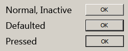
There are four states that a non-themed button can be in: normal, pressed, defaulted or inactive. How can we draw these states?
The rough non-themed equivalent of the DrawThemeBackground function is the DrawFrameControl function. It has a parameter uType that specifies the type of the frame control to draw – in our case, this should be DFC_BUTTON (= 4). The next parameter is uState. We should set this to DFCS_BUTTONPUSH (=0x0010). For the normal state, this is all that needs to be done. For the inactive state, we should set uType to DFCS_INACTIVE (=0x0100) | DFCS_BUTTONPUSH (in fact, this doesn’t seem to change the appearance of the button frame; the button content/text should be rendered as gray, but that’s out of the scope of this article).
When a non-themed button is pressed or defaulted, it has a single pixel border drawn around it, and the frame control’s bounding rectangle is contracted by 1 pixel on each side. The border’s colour is that of the window frame (COLOR_WINDOWFRAME = 6) – you can use the GetSysColorBrush function to get the appropriate brush. For the defaulted state, just call DrawFrameControl with uType set to DFCS_BUTTONPUSH (with the deflated rectangle). For the pressed state, it might seem like DFCS_PUSHED should be used for uType, but this creates an appearance different to that of standard push buttons. This style is used elsewhere, like on the Windows taskbar, for scrollbar buttons and window caption buttons, etc. Internet Explorer’s owner/custom-drawn buttons also use this style, and I’m sure many other programs do, too. It should be avoided, however, if you’re seeking the native appearance. To properly imitate a pressed push button, avoid using the DrawFrameControl function and use the FrameRect function to draw an inner border with the button shadow colour (COLOR_BTNSHADOW = 16). It’s important to then use the FillRect function to draw the background with the button face colour (COLOR_BTNFACE = 15).
Here’s some pseudocode to illustrate the whole process:
|
1 2 3 4 5 6 7 8 9 10 11 12 13 14 15 16 17 18 19 20 21 22 23 24 25 |
/* state = the button state rect = the bounding rectangle */ uType = DFCS_BUTTONPUSH; if (state == DISABLED) uType |= DFCS_INACTIVE; if (state == DEFAULTED || state == PRESSED) { // draw the border if the push button is defaulted or pressed brush = GetSysColorBrush(COLOR_WINDOWFRAME); FrameRect(dc, &rect, brush); // deflate the rect to exclude the border just drawn DeflateRect(&rect, 1, 1); } if (state != PRESSED) { // if the button’s not pressed, we can use DrawFrameControl DrawFrameControl(dc, &rect, DFC_BUTTON, uType); } else { // draw the inner shadow brush = GetSysColorBrush(COLOR_BTNSHADOW); FrameRect(dc, &rect, brush); // deflate the rect to exclude the inner border just drawn DeflateRect(&rect, 1, 1); // draw the button face colour brush = GetSysColorBrush(COLOR_BTNFACE); FillRect(dc, &rect, brush); } |
In addition to drawing the background, note that for all states but pressed, the content (text) should be shifted one pixel left and one pixel up. When the button is pressed, it should move one pixel right and one pixel down, so it is centred in the button. Some owner/custom-draw implementations neglect this detail.
Theming & Visual Styles in Windows 8
The following is based on the Windows Developer Preview and might not accurately represent the final version of Windows 8.
A significant change in Windows 8 is the removal of support for Windows classic theming. In the Windows Developer Preview, there is no Windows Classic theme, and all themes (including Windows Basic and the four high contrast themes) use the Desktop Window Manager (DWM) for desktop composition (in Windows Vista and Windows 7, it was only enabled for Aero themes).
While some users may miss the Windows Classic theme (it might return in later builds, of course), this is definitely a positive development. All themes will receive the benefits of hardware acceleration, and there will no longer be the need to maintain a separate code path for when the DWM is disabled (as long as the program targets only Windows 8 or later).
In order to maintain compatibility with earlier versions of Windows, when a high contrast theme is selected, Windows 8 will simulate the Windows classic theming model unless an application specifies Windows 8 as a supported OS in its application manifest. The sample program I made for the previous post did not include such a manifest, so it doesn’t work correctly in the Windows Developer Preview with high contrast themes: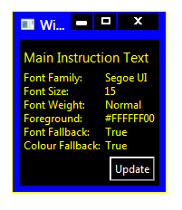
Compare this to a task dialog:
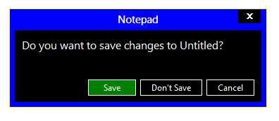
(The button in the WPF window is also drawn incorrectly, but presumably that will be fixed in .NET 4.5.)
Adding the appropriate manifest to the application causes it to work as it should:
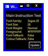
I’ve updated the sample code in the previous post to include the manifest file.
Windows Theme Fonts
Update: See this post for a sample implementation in WPF.
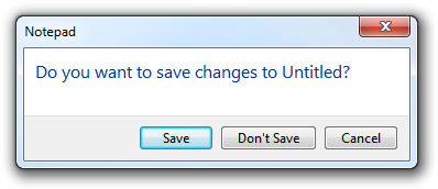
Have you ever wondered how to access the various font colours and styles found throughout Windows, such as that of the ‘Main Instruction’ text in the Task Dialog shown above?
If you are using WPF, the SystemFonts class might sound promising at first. However, this class only exposes the following: the icon font, caption font, small caption font, menu font, message font and status font. These aren’t very exciting – in fact, they are all simply 9pt Segoe UI in Windows Vista/7 Aero. (Aside: early Windows 8 builds use 11pt Segoe UI Semilight as the caption (and small caption) font.) For those using Win32 directly, the SystemFonts class wraps around the SystemParametersInfo function (specifically with the messages SPI_GETNONCLIENTMETRICS and SPI_GETICONTITLELOGFONT) the GetThemeSysFont function.
MSDN offers some guidance on default fonts and colours in Windows Vista/7: apparently ‘Main Instruction’ text is 12pt #003399 Segoe UI. This table, while helpful, is not comprehensive, and in general it’s not a good idea to hard-code this kind of thing, as themes/visual styles are liable to change.
The keys lie in the Visual Styles APIs, introduced in Windows XP. In particular, the GetThemeFont function and GetThemeColor function (with the TMT_TEXTCOLOR property identifier), both found in UxTheme.dll. We simply need to specify the ‘part and state’ of the control in question (these are defined in Vsstyle.h and Vssym32.h). ‘Main Instruction’ text, for example, is referenced by the TEXT_MAININSTRUCTION part in the TEXTSTYLE class.
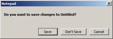
Regrettably, visual styles APIs only work when visual styles are enabled (who’d have thought it?). That is to say, we can’t rely on them with classic themes (Windows Classic and the High Contrast themes).
I emailed the very knowledgeable Larry Osterman about this, and he was kind enough to respond:
AeroStyle.xml tells which metrics to ask for which theme parts (for the OS that matches the version of the SDK it’s in), but there’s no theme API support for classic modes.
Basically they get the metric they’re looking for from the AeroStyle.xml file.
AeroStyle.xml is included in the latest versions of the Windows SDK. It contains the same classes and parts and states mentioned earlier in an XML format. The ‘MainInstruction’ part in the ‘TextStyle’ class looks like this, for instance:
|
1 2 3 4 5 6 7 8 9 10 11 |
<class name="TextStyle"> <part name="MainInstruction"> <caption> <TextColor>0 51 153</TextColor> <Font>Segoe UI, 12, Quality:ClearType</Font> <ClassicValue type="TextColor">WindowText</ClassicValue> <ClassicValue type="Font">CaptionFont</ClassicValue> </caption> </part> ... </class> |
Of interest are the ‘ClassicValue’ elements. When visual styles are disabled, it seems that ‘Main Instruction’ text uses the caption font (8pt bold Microsoft Sans Serif, as it happens).
In closing: you can use GetThemeFont and GetThemeColor if visual styles are enabled, but you will need look at AeroStyle.xml and hard-code the classic theme fall-back values.