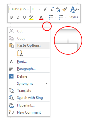
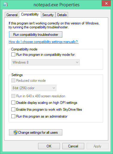
Update (2013-04-21): the thin borders are all gone in build 9374.
It looks like Microsoft isn’t changing tack with the next release of Windows – the recently leaked build 9364 of Windows ‘Blue’ contains a bunch of worthwhile changes to the Modern/Metro/Immersive environment, but the desktop seems to be basically untouched from Windows 8. If you hated Windows 8, you’ll probably hate Windows ‘Blue’. If you’re ambivalent, like me, about Windows 8, you’ll probably feel the same way about Windows ‘Blue’. I don’t think I’ve met anyone who loves Windows 8 outright, but that person will love Windows ‘Blue’.

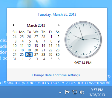
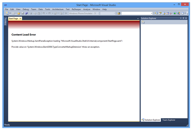
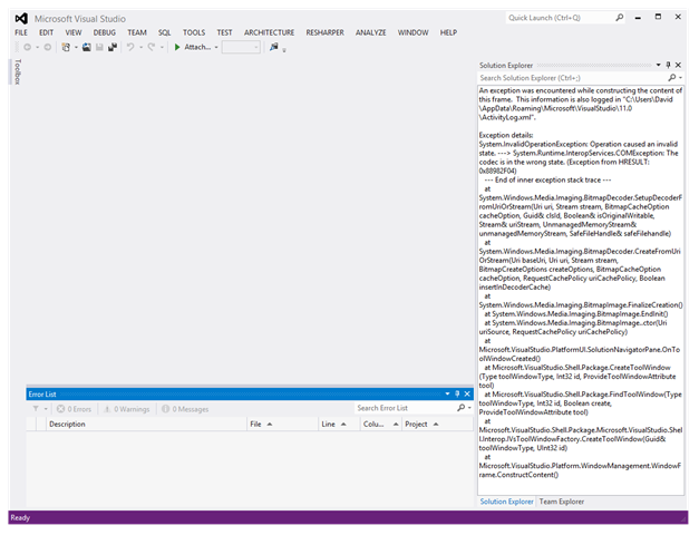
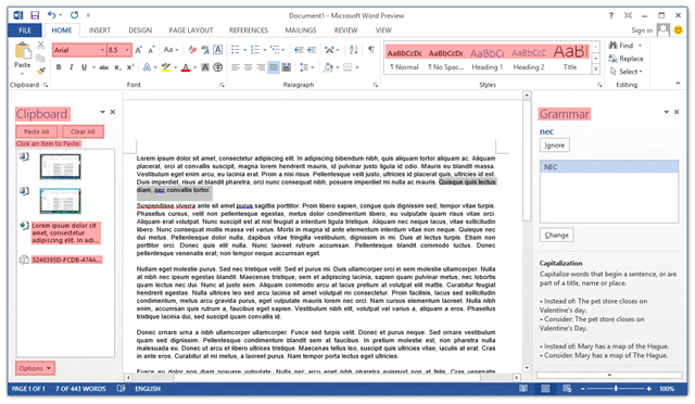
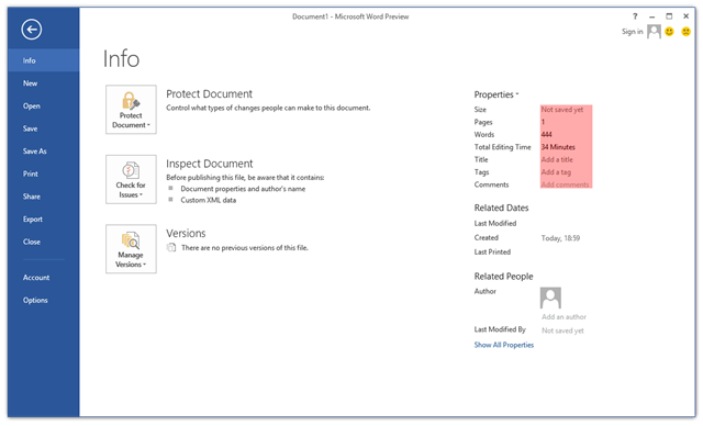
The only UI changes on the desktop that I’ve spotted so far are related to window borders – the borders of the clock and action centre pop-up windows are now 1 pixel wide (and the windows are set 16 pixels from the edge of the screen/taskbar). The volume control retains the Windows 7/8 look (fat borders, 8 pixel margin). Continuing on the theme of window borders, certain windows have thin (~3 pixel) borders, as shown below. I’m not sure what window styles cause this effect, but the same thing happened in pre-release Windows 8.

On the Modern-Desktop integration front, bringing up the ‘Share Charm’ now has options for sharing a screenshot of the desktop (though I can’t get this to work) and for opening SkyDrive. That’s about it.
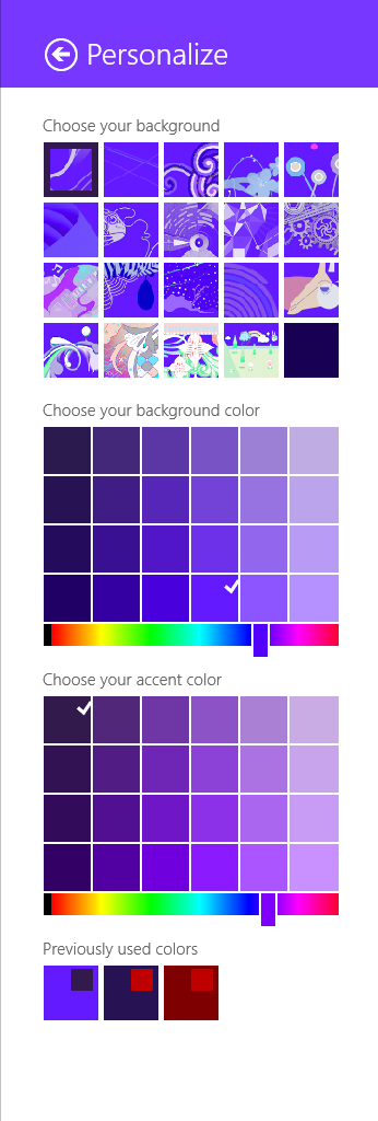
The method of selecting theme accent and background colours has changed significantly, and it seems like that post I wrote about the GetImmersiveColor* functions will be obsolete soon. It’s now possible to select basically any colour combination (see below), which makes it quite easy to get unreadable text. Too much choice can be a bad thing, and I prefer the Windows 8 approach of a limited set of colour combinations that have been tested thoroughly to make sure all text is readable.

It will be interesting to see how quickly this version is pushed out the door. I’m quite surprised to see the version number bumped up to 6.3 (Windows 8 is 6.2), which could indicate that this will be a bigger release than many had assumed. It would be nice if the desktop got a bit more attention, but I’m not holding out hope. In this early build of Windows ‘Blue’, none of my pet issues are solved (ClearType missing from text drawn on opaque surfaces for no reason, unnecessary Modern UI encroaching on the desktop for network settings and ‘open with’ dialogs, etc., no Windows Update notifications on the desktop, Modern UI scrollbars in desktop IE, and so on and so forth).
