I’ve belatedly updated my Windows System Colours Reference and post about Segoe UI to reflect changes in the Windows 8 Release Preview.
Tag: windows 8
More on Segoe UI in Windows 8
Note: the following is based on the Windows 8 Release Preview (build 8400) and may not accurately reflect the final version of Windows 8. I’ll update this post if there are changes in future builds.
Updated: The fonts have been updated in the public beta (Windows Consumer Preview) and release candidate (Windows Release Preview) and I’ve changed the tables below to reflect this. I was also made aware of some additional information about changes to Segoe UI, including new stylistic sets and support for ligatures: you can read more at Subacme.
Further to my earlier post about Segoe UI Light in Windows 8, I’ve done some more research into the changes to the Segoe family of fonts. The Fonts class in the .NET Framework was helpful for retrieving information about the fonts.
First off, Segoe Print and Segoe Script and their bold variants have not been modified and are still labelled version 5.02 and 5.00, respectively. All existing variants of Segoe UI have been updated, and there is one new variant: Segoe UI Semilight. The latter is in fact used as the caption and small caption font in Windows 8 – Windows Vista and Windows 7 used Segoe UI (Regular). The Windows Phone 7 platform includes Segoe WP Semilight, and Segoe UI Semilight seems to be a superset of that font.
Apparently new in the Windows 8 Release Preview are three italic variants: Segoe UI Light Italic, Segoe UI Semibold Italic and Segoe UI Semilight Italic.
The following tables summarise the differences in glyph and character counts between the Windows 7 and Windows 8 versions of the Segoe UI font family:
Segoe UI Regular
| Windows 7 | Windows 8 Developer Preview | Windows 8 Consumer Preview | Windows 8 Release Preview | |
| Version | 5.01 | 5.12 | 5.16 | 5.24 |
| Glyphs | 2899 | 4281 | 4490 | 4516 |
| Characters | 2658 | 3283 | 3423 | 3404 |
Segoe UI Bold
| Windows 7 | Windows 8 Developer Preview | Windows 8 Consumer Preview | Windows 8 Release Preview | |
| Version | 5.01 | 5.12 | 5.15 | 5.24 |
| Glyphs | 2899 | 4290 | 4428 | 4442 |
| Characters | 2658 | 3283 | 3421 | 3401 |
Segoe UI Italic
| Windows 7 | Windows 8 Developer Preview | Windows 8 Consumer Preview | Windows 8 Release Preview | |
| Version | 5.01 | 5.10 | 5.15 | 5.22 |
| Glyphs | 2381 | 2478 | 2597 | 3077 |
| Characters | 2130 | 2180 | 2299 | 2525 |
Segoe UI Bold Italic
| Windows 7 | Windows 8 Developer Preview | Windows 8 Consumer Preview | Windows 8 Release Preview | |
| Version | 5.01 | 5.10 | 5.15 | 5.22 |
| Glyphs | 2381 | 2478 | 2597 | 3077 |
| Characters | 2130 | 2180 | 2299 | 2525 |
Segoe UI Light
| Windows 7 | Windows 8 Developer Preview | Windows 8 Consumer Preview | Windows 8 Release Preview | |
| Version | 5.00 | 5.12 | 5.15 | 5.25 |
| Glyphs | 2380 | 4036 | 4178 | 4236 |
| Characters | 2131 | 3090 | 3230 | 3211 |
Segoe UI Light Italic
| Windows 8 Release Preview | |
| Version | 5.22 |
| Glyphs | 3089 |
| Characters | 2525 |
Segoe UI Semibold
| Windows 7 | Windows 8 Developer Preview | Windows 8 Consumer Preview | Windows 8 Release Preview | |
| Version | 5.00 | 5.12 | 5.16 | 5.24 |
| Glyphs | 2380 | 4089 | 4228 | 4242 |
| Characters | 2131 | 3144 | 3231 | 3211 |
Segoe UI Semibold Italic
| Windows 8 Release Preview | |
| Version | 5.22 |
| Glyphs | 3089 |
| Characters | 2525 |
Segoe UI Semilight
| Windows 7 | Windows 8 Developer Preview | Windows 8 Consumer Preview | Windows 8 Release Preview | |
| Version | N/A | 5.12 | 5.15 | 5.24 |
| Glyphs | N/A | 4034 | 4175 | 4189 |
| Characters | N/A | 3090 | 3230 | 3210 |
Segoe UI Semilight Italic
| Windows 8 Release Preview | |
| Version | 5.23 |
| Glyphs | 3089 |
| Characters | 2525 |
Segoe UI Symbol
| Windows 7 | Windows 8 Developer Preview | Windows 8 Consumer Preview | Windows 8 Release Preview | |
| Version | 5.00 | 5.33 | 5.46 | 5.55 |
| Glyphs | 3090 | 5122 | 6785 | 6846 |
| Characters | 2864 | 4547 | 5092 | 5217 |
Supported Unicode Blocks
For further information about which Unicode blocks are supported by the Segoe family of fonts, you can download my extended analysis here:
segoe-analysis.7z
2,825 bytes; SHA-1: DFFA40934DB3305054C40AF3FD6E7224F5CF1EFB
Segoe UI Light Improvements in Windows 8
Windows 7 comes with Segoe UI Light version 5.00/0.90. Windows 8 (as of the Windows Consumer Preview) comes with version 5.15, which has been hinted at various sizes. This comes as a very welcome change, especially with Microsoft using Segoe UI Light all over the place in its latest webpage designs. I recommend grabbing the updated versions of Segoe UI from Windows 8 for your Windows 7 or Windows Vista machines.
As others have complained, the lack of hinting in version 5.00 is particularly noticeable with lowercase bs, ds, ps and qs, the ‘round parts’ of which don’t line up well with other characters. The heights of numerals are also variable at some sizes.
Have a look at the following screenshots for a better idea of the differences (click the images to see the full sizes).
Version 5.00
Version 5.15
Difference
Theming & Visual Styles in Windows 8
The following is based on the Windows Developer Preview and might not accurately represent the final version of Windows 8.
A significant change in Windows 8 is the removal of support for Windows classic theming. In the Windows Developer Preview, there is no Windows Classic theme, and all themes (including Windows Basic and the four high contrast themes) use the Desktop Window Manager (DWM) for desktop composition (in Windows Vista and Windows 7, it was only enabled for Aero themes).
While some users may miss the Windows Classic theme (it might return in later builds, of course), this is definitely a positive development. All themes will receive the benefits of hardware acceleration, and there will no longer be the need to maintain a separate code path for when the DWM is disabled (as long as the program targets only Windows 8 or later).
In order to maintain compatibility with earlier versions of Windows, when a high contrast theme is selected, Windows 8 will simulate the Windows classic theming model unless an application specifies Windows 8 as a supported OS in its application manifest. The sample program I made for the previous post did not include such a manifest, so it doesn’t work correctly in the Windows Developer Preview with high contrast themes: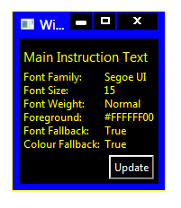
Compare this to a task dialog:
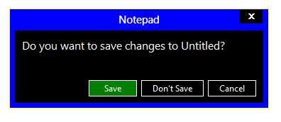
(The button in the WPF window is also drawn incorrectly, but presumably that will be fixed in .NET 4.5.)
Adding the appropriate manifest to the application causes it to work as it should:
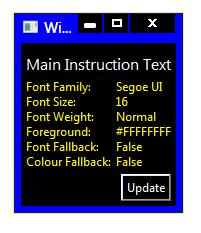
I’ve updated the sample code in the previous post to include the manifest file.
Windows 8: Bypassing the Start screen
After using the Windows Developer Preview (that is, Windows 8 pre-beta) build for a little while, I’m not at all sold on the Start screen as a replacement for the Start menu for keyboard-and-mouse users. I’m not giving up all hope yet, though – I wasn’t overly fond of the Backstage view when I first tried early builds of Office 2010, which similarly replaced what was a simple menu in Office 2007 with a full screen experience, but I’ve since grown to like it. And, of course, development is far from over at this stage.
I’ll be very surprised if I end up using any ‘Metro style’ applications on my desktop or laptop PCs, however. I’m happy to revisit this statement after Windows 8 launches, but the experience does seem much more suited to tablet and phone form factors (and I’d take a traditional PC any day).
There doesn’t seem to be an official way to disable the Start screen, which is not surprising (it would be akin to disabling the ribbon in Office 2007/2010). What is surprising is that it’s actually quite easy to do: just rename shsxs.dll in %windir%System32 and restart (thanks givebackstartmenu): voilà! The highly usable Start menu of Windows 7 returns. It will be interesting to see whether this remains an ‘option’ in future builds. Note that this disables the modern Task Manager, and potentially breaks other functionality, too.
A less radical option is enabling the Group Policy setting ‘Do not show the Start Menu when the user logs in’ (User ConfigurationAdministrative TemplatesStart Menu and Taskbar). This will open the traditional desktop directly after logging in, skipping the Start screen (but leaving it enabled). My initial impression is that this should be the default for non-touch/stylus form factors, but I’ll keep an open mind about that. Unfortunately, this setting isn’t actually working for me (possible PEBKAC). It seems to be connected to a DWORD in the Registry called ‘DontShowStartMenuOnLogin’. Modifying this also has no effect in the Windows Developer Preview.
Office 15: per application border colours?
Winreview.ru’s latest Office 15 screenshots reveal application-specific border colours and drop-shadows. Word gets a dark blue border and shadow, Excel gets a green border and shadow, etc.:
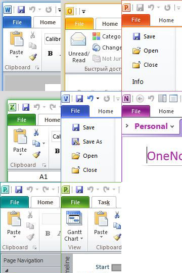
Microsoft in fact applied for a patent for per-window glass colourisation in late 2005 (‘Glass appearance window frame colorization’; discovered by Long Zheng in 2007). While there isn’t any glass in the Office 15 windows shown here (despite the DWM being enabled), the idea is similar.
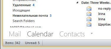
Office 15 and Windows 8 seem to be moving in similar UI directions – it seems like square corners are in and transparency is out (at least for the ‘Aero Lite’ theme).
Early Windows 8 UI Changes
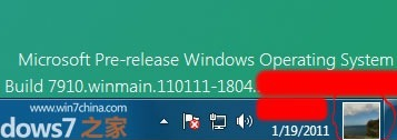
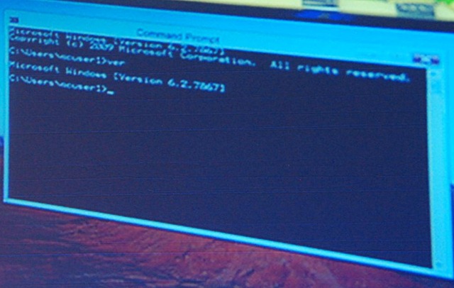
Some early screenshots of Windows 8 have leaked recently, providing some clues as to what changes we might see in the user interface.
- User Account Pictures in the Taskbar
Two screenshots show a 32×32 px (actually 28×32 px in the second screenshot) user account picture in the taskbar, located between the clock and ‘show desktop’ button:
- Updated Language Bar
Assuming the ‘ENG’ in the second screenshot above refers to ‘English’, an updated language bar may be part of Windows 8. (The three letter language code would mark a change from ISO 639-1 found in previous versions of Windows to ISO 639-2.)
- Centred Window Titles
Rafael Rivera spotted this in Sinofsky’s Windows 8 ARM demo at CES earlier this year. (Photo by Long Zheng.)
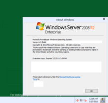
A new screenshot seems to confirm this:
Windows has had left-aligned window title text since Windows 95 – in Windows 3.1 and earlier it was centred. Office 2007 and 2010 notably broke that convention, however, using centred text as part of their custom-drawn title bars (make a Microsoft Word window narrow enough and you can see the custom chrome replaced with the OS standard).
Refreshed DWM-lessNew ThemeWhile the resolution of the screenshot immediately above leaves a lot to be desired, we can still see some clear differences from Aero Basic as it appears in Windows Vista and Windows 7 (update: in fact, this theme might be a DWM-enabled theme). The window border colour is almost flat (there is a very subtle gradient), the window corners appear to be square at the top as opposed to just the bottom, and the ‘X’ on the close button is coloured black, not white (the window appears not to be active). Additionally, it looks like the close button is flush with the window border (as in Aero), in contrast to Aero Basic where a 7 pixel border is drawn above the caption buttons. Finally, the button control seems to have a new theme.


