Windows 8.1 Impressions

Windows 8.1 is done, though Microsoft is apparently worried enough about driver and application support that not even loyal MSDN and TechNet subscribers will get it until October 17 this year. To no-one’s surprise, the RTM ISOs were promptly leaked, which leaves us in the odd situation where the only way to test your programs against the latest version of Windows is to download disc images from shady websites.

My impressions of Windows 8.1 don’t differ much from what I wrote earlier this year when it was still ‘Windows Blue’: no-one who hates Windows 8 is going to be swayed by Windows 8.1, but if you love Windows 8, you’ll probably love Windows 8.1.

For all that’s been written about the return of the Start Button, there are very few concessions towards desktop users in Windows 8.1. Including ‘boot to desktop’ and ‘use desktop background on Start Screen’ as options makes the overall user experience slightly less jarring, but it’s really nothing to get excited about. I highly recommend StartIsBack to restore the Windows Vista/7-style Start Menu. Start Menu programs abound (what does that tell you?), but StartIsBack really feels like it’s part of Windows, not a third-party program.

The biggest change that Windows 8.1 brings to the desktop is improved high DPI support – Windows now supports per-monitor DPI, and no longer requires users to log off in order to change their DPI settings. I’m sceptical about how many applications will bother supporting this functionality, but it’s a nice feature to have.

Given that Windows 8.1 doesn’t offer much to desktop users like me, I might as well write about annoyances introduced with this version.

New annoyances

  • Microsoft has made it hard to create a local account when installing Windows (as opposed to using a Microsoft account to sign in). Windows 8 strongly encouraged you to use a Microsoft account, but Windows 8.1 is worse – the only methods I’ve found to avoid this are to disable network connections or to type in a bogus email address – only then will Windows offer to create a local user account.
  • SkyDrive is now integrated with Windows, but apparently only if you sign in with a Microsoft account (see above). I guess I won’t be using the desktop SkyDrive client anymore.
  • Libraries are hidden by default, and even when they’re turned on, the navigation pane in File Explorer is polluted with shortcuts to the ‘Desktop’, ‘Documents’, ‘Downloads’, ‘Music’, ‘Pictures’ and ‘Videos’ folders (not libraries), as is the main ‘This PC’ (formerly ‘Computer’ – who decided changing that was a good idea?).
  • Unlike some, I don’t hate the default background images (though I question the choice of the orange default image), but the JPEG compression is horrendous. I’m shocked that Microsoft included such low-quality images in Windows.

None of these are show-stoppers, but coupled with the fact that Windows 8.1 offers almost nothing new for desktop users, it’s hard to get excited about this update.
Theme Colours in Windows ‘Blue’

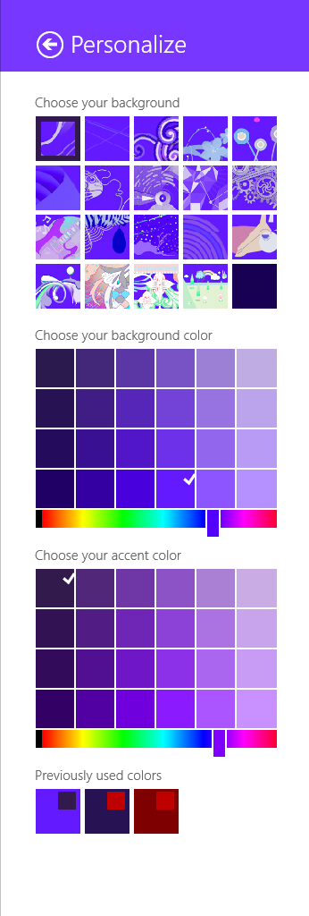
As I noted in my earlier post, the method for selecting theme (‘accent’) colours in Windows ‘Blue’ build 9364 has changed from Windows 8 RTM. I’m not going to bother looking too closely at the updates to the functions in UxTheme.dll this early in the development process, but I did notice two new registry values in the key HKCUSoftwareMicrosoftWindowsCurrentVersionExplorerAccent: ‘AccentColor’ and ‘StartColor’. These are DWORD values that store the accent colour and background colour, respectively. The format is 0xAABBGGRR. The old ‘ColorSet_Version3’ value from Windows 8 is gone for obvious reasons. ‘AccentId_v8.00’ from Windows 8 is now ‘MotionAccentId_v1.00’, but it seems to serve the same purpose – indicating which background image is selected.

Windows ‘Blue’ Build 9364 Observations

Update (2013-04-21): the thin borders are all gone in build 9374.

It looks like Microsoft isn’t changing tack with the next release of Windows – the recently leaked build 9364 of Windows ‘Blue’ contains a bunch of worthwhile changes to the Modern/Metro/Immersive environment, but the desktop seems to be basically untouched from Windows 8. If you hated Windows 8, you’ll probably hate Windows ‘Blue’. If you’re ambivalent, like me, about Windows 8, you’ll probably feel the same way about Windows ‘Blue’. I don’t think I’ve met anyone who loves Windows 8 outright, but that person will love Windows ‘Blue’.

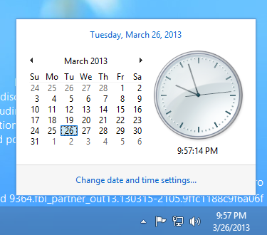
Screenshot of Windows 'Blue' Clock

The only UI changes on the desktop that I’ve spotted so far are related to window borders – the borders of the clock and action centre pop-up windows are now 1 pixel wide (and the windows are set 16 pixels from the edge of the screen/taskbar). The volume control retains the Windows 7/8 look (fat borders, 8 pixel margin). Continuing on the theme of window borders, certain windows have thin (~3 pixel) borders, as shown below. I’m not sure what window styles cause this effect, but the same thing happened in pre-release Windows 8.

Screenshot of Windows 'Blue' Window Borders


On the Modern-Desktop integration front, bringing up the ‘Share Charm’ now has options for sharing a screenshot of the desktop (though I can’t get this to work) and for opening SkyDrive. That’s about it.

The method of selecting theme accent and background colours has changed significantly, and it seems like that post I wrote about the GetImmersiveColor* functions will be obsolete soon. It’s now possible to select basically any colour combination (see below), which makes it quite easy to get unreadable text. Too much choice can be a bad thing, and I prefer the Windows 8 approach of a limited set of colour combinations that have been tested thoroughly to make sure all text is readable.

Screenshot of Windows 'Blue' Personalisation


It will be interesting to see how quickly this version is pushed out the door. I’m quite surprised to see the version number bumped up to 6.3 (Windows 8 is 6.2), which could indicate that this will be a bigger release than many had assumed. It would be nice if the desktop got a bit more attention, but I’m not holding out hope. In this early build of Windows ‘Blue’, none of my pet issues are solved (ClearType missing from text drawn on opaque surfaces for no reason, unnecessary Modern UI encroaching on the desktop for network settings and ‘open with’ dialogs, etc., no Windows Update notifications on the desktop, Modern UI scrollbars in desktop IE, and so on and so forth).